REIMAGINING AIRLINE MANAGEMENT
REIMAGINING AIRLINE MANAGEMENT
AirDash
AirDash

The Challenge
Design an operational dashboard that can help airlines manage travel disruptions and provide valuable insights to improve airline profitability using Sabre's Intelligence Exchange.
Proccess Overview
Proccess Overview
Understand
To create the most successful solution, we needed to understand the technology that is already created and being used across Sabre and the customers that use it.
To create the most successful solution, we needed to understand the technology that is already created and being used across Sabre and the customers that use it.
Ideate
Complete ideation sessions and create sketches as a team so we come to a consensus of the best path to follow.
Produce
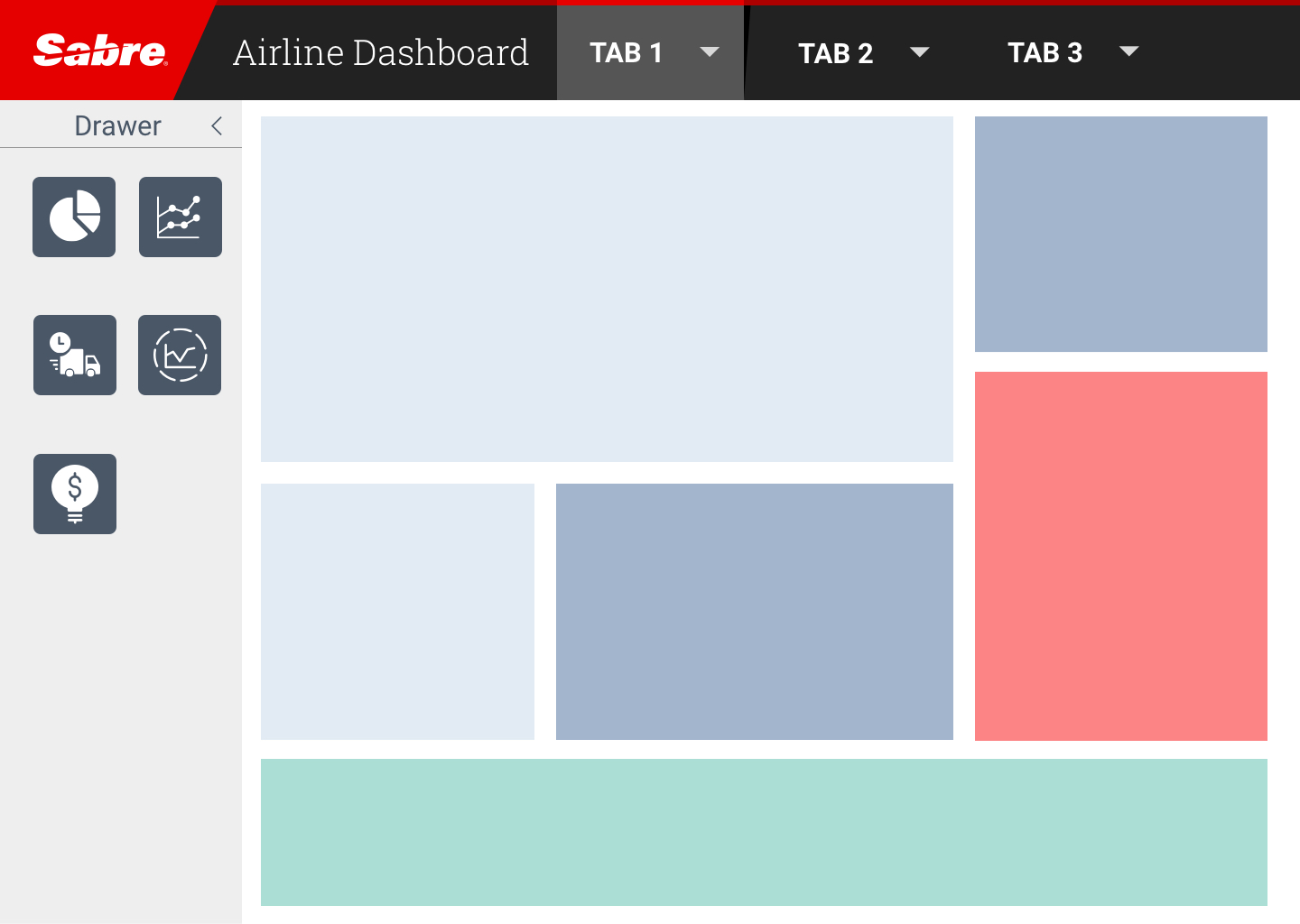
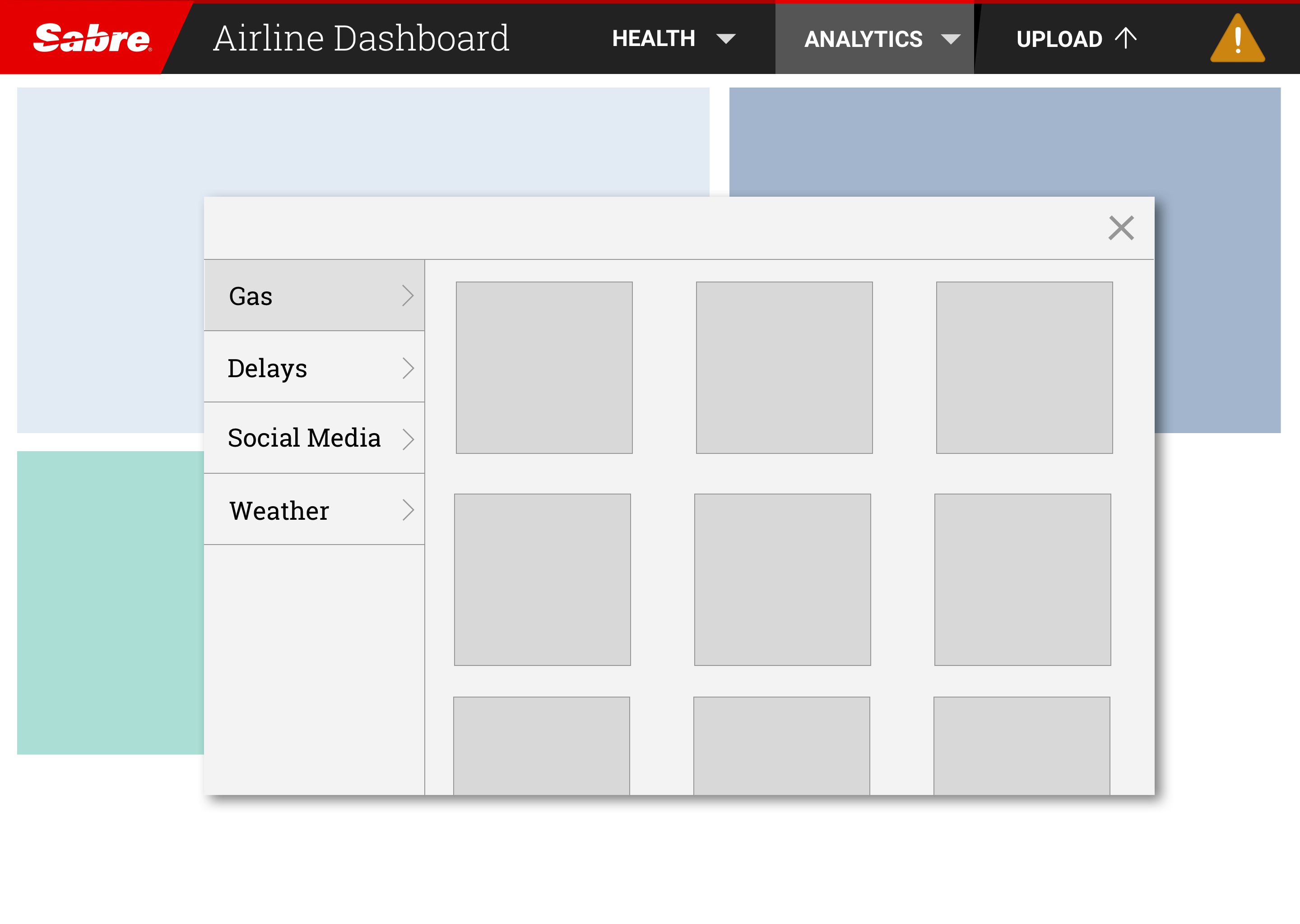
Create mockups of the design beginning from low fidelity to slowly work out the kinks. Present mockups to stakeholders to gain perspective on improvements.
Understand
Running an airline is no minor feat. There are tons of moving parts including flight routes, how much fuel the flights use, wait times for customers to get on the plane, which crew members need to go on what flights, backup plan for when systems go down, and many many more. It becomes challenging for managers and executives to figure out the optimal path forward for each case, and make their buisness more effective overall. After talking to researchers, we discovered 3 major pain points:
1
Many Sources of Information
There were way too many sources of information for management to sort through. This would cause frustration due to the inability to find the precise information they needed.
2
Time Consuming
In addition to the frustration, it would take a lot of time out of the day for workers to look search for the information, and then do data visualizations themselves to figure out what needs to be done.
3
Lack of Full Picutre
In addition to the frustration, it would take a lot of time out of the day for workers to look search for the information, and then do data visualizations themselves to figure out what needs to be done.
Sabre's Intelligence Exchange
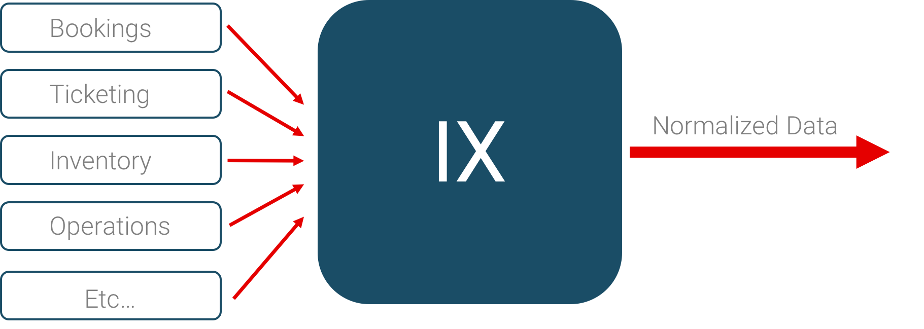
The hardest part of the case was to understand the system we were building our application on top of, which was Sabre's Intelligence Exchange (IX). Essentially, it is a system that takes data from many different sources, normalizes it, and outputs the data in a way that is comparable and that other applications, such as Airdash, can use. We had to consider this technology's capabilities as we worked on our case.
Ideate
Ideation Session
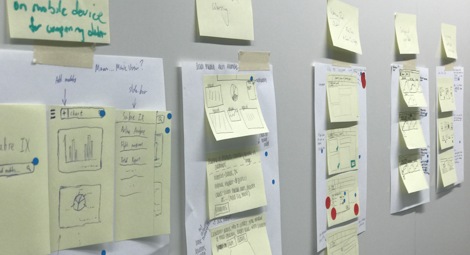
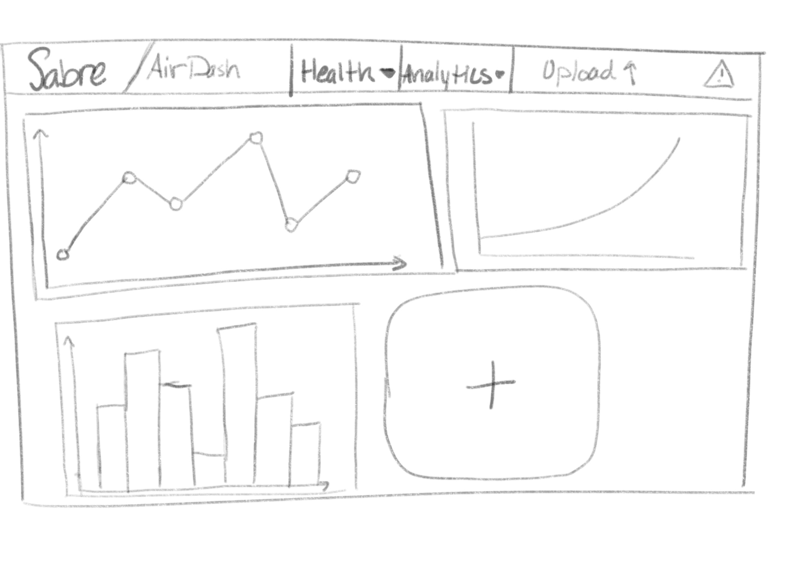
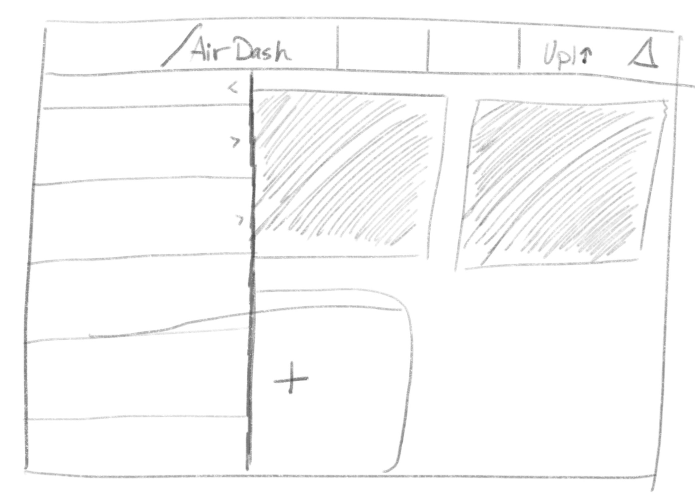
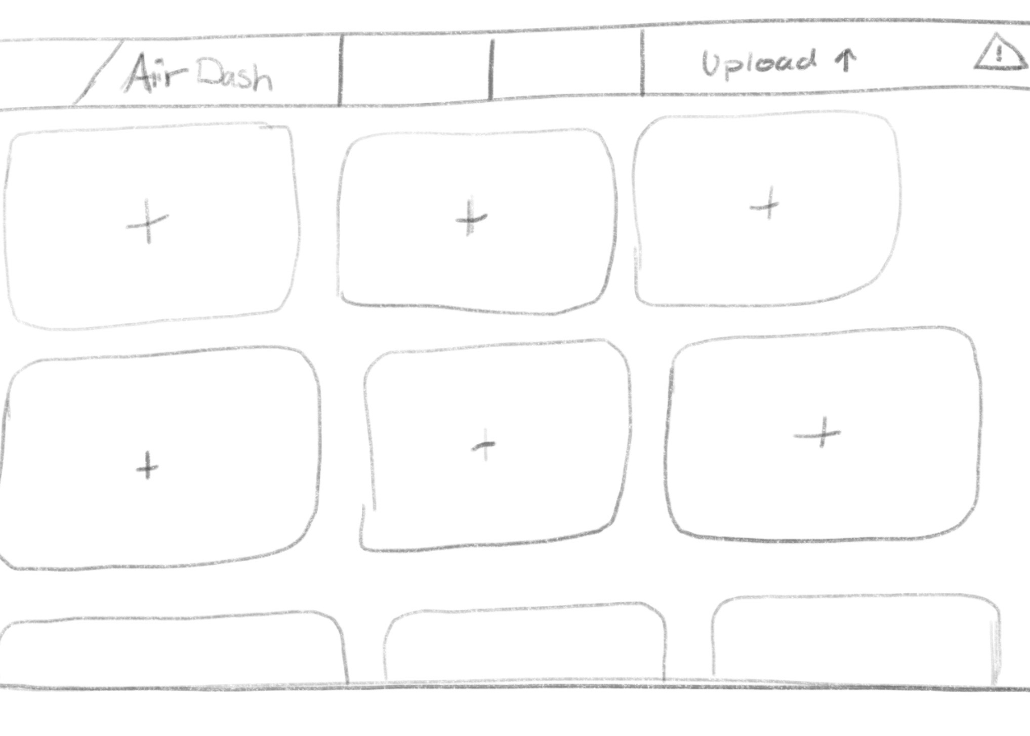
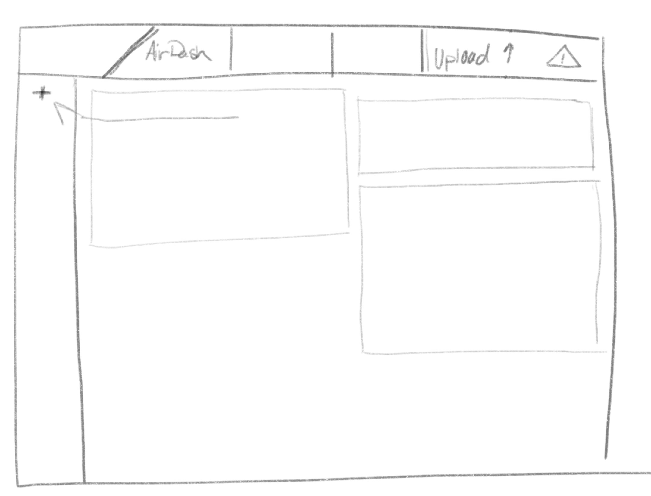
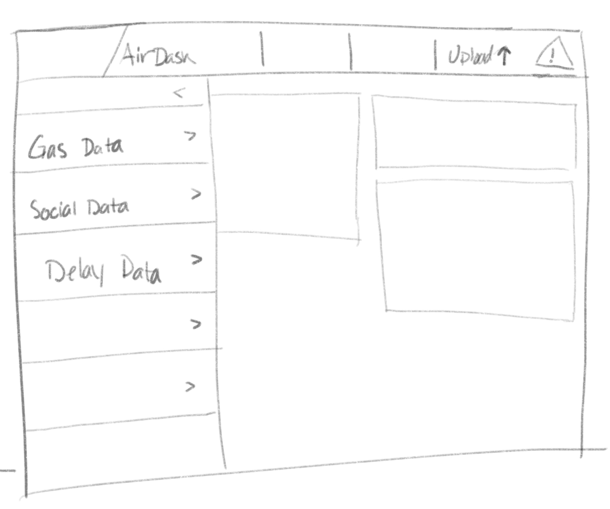
As a team, we completed a two hour design sprint to discover how to procede with our design and idea. To start off, we each sketched eight ideas in a limited time frame of different features or functionalities that we thought AirDash should have. We then each chose our favorite idea from the eight sketches, and pitched it to the team to get feedback. Then we took that idea and the feedback and sketched eight different versions of the sketch. We shared again, and gave feedback. After, we each made a three pannel storyboard to demonstrate how our idea would work within the application. Then, we each used dots to vote on our favorite ideas between the five of us, so we could come to a consensus of what direction we wanted to pursue.
Sketching
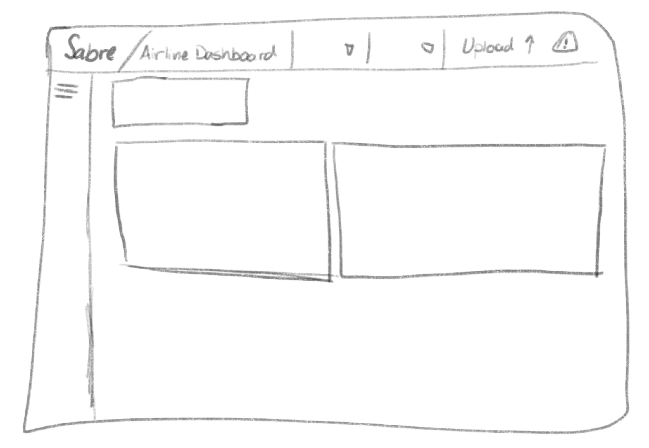
Low-Fi Mockups
Throughout the project, there was regular consulting with subject matter experts across the company. I got feedback from the UX team around my designs in accordance to the needs and requirements from the SMEs.
Produce
Operations
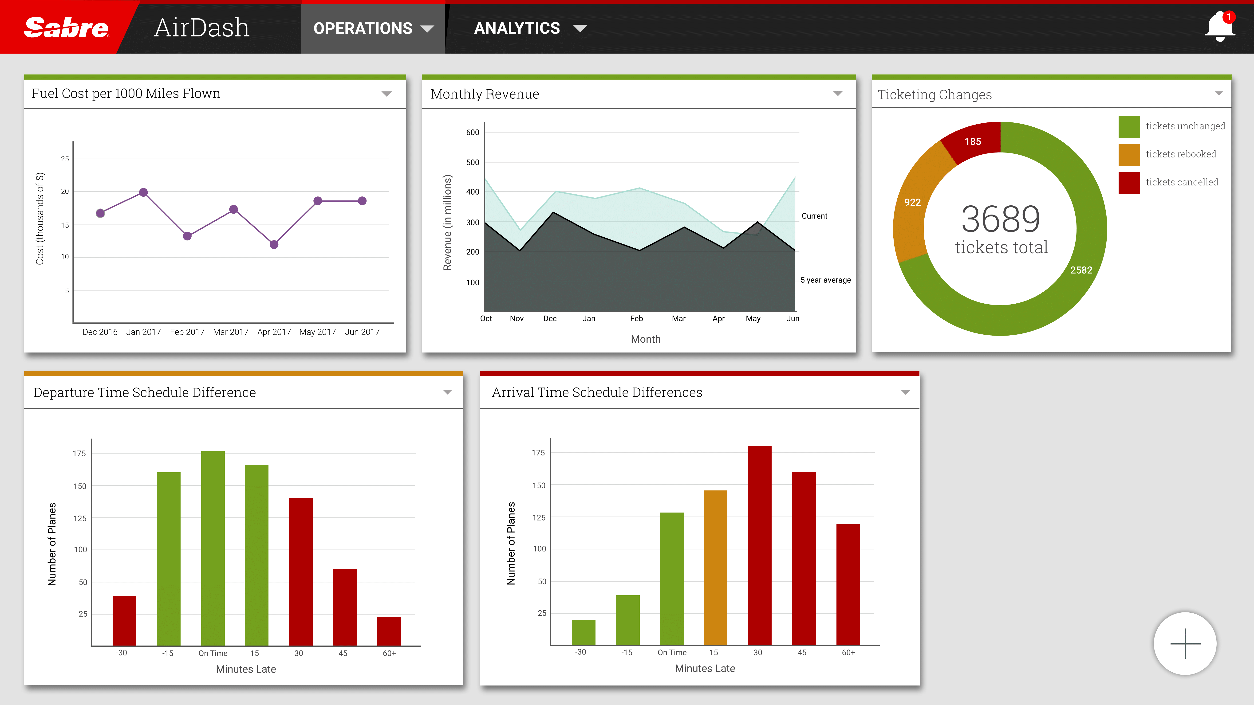
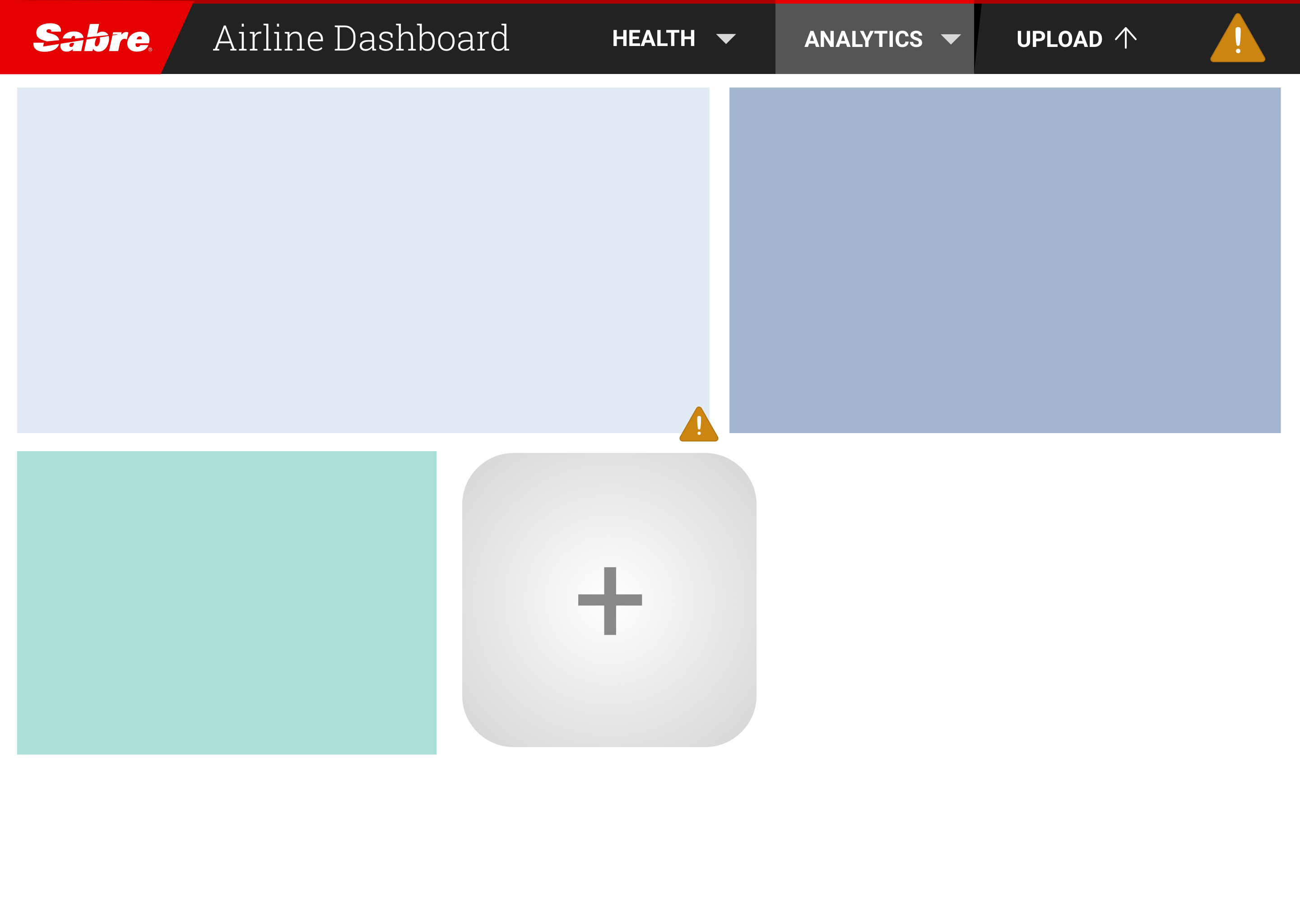
Airdash gives a day-by-day view about how the airline is performing. Each piece of information is coming from a different part of the airline’s systems, as well as from Sabre systems. We are able to display it all in one place thanks to the Intelligence Exchange.
Some of our features include indicators above each KPI in green, yellow, and red. Each color indicates the state of that part of the airline. When the metric is green, it means that everything is normal and running fine. However, the indicator may change to red if the data trends start to change, as a signal that someone might want to take a look. The red indicator means that the data coming into IX is abnormal, and some sort of action needs to be done try to fix it.
Analytics
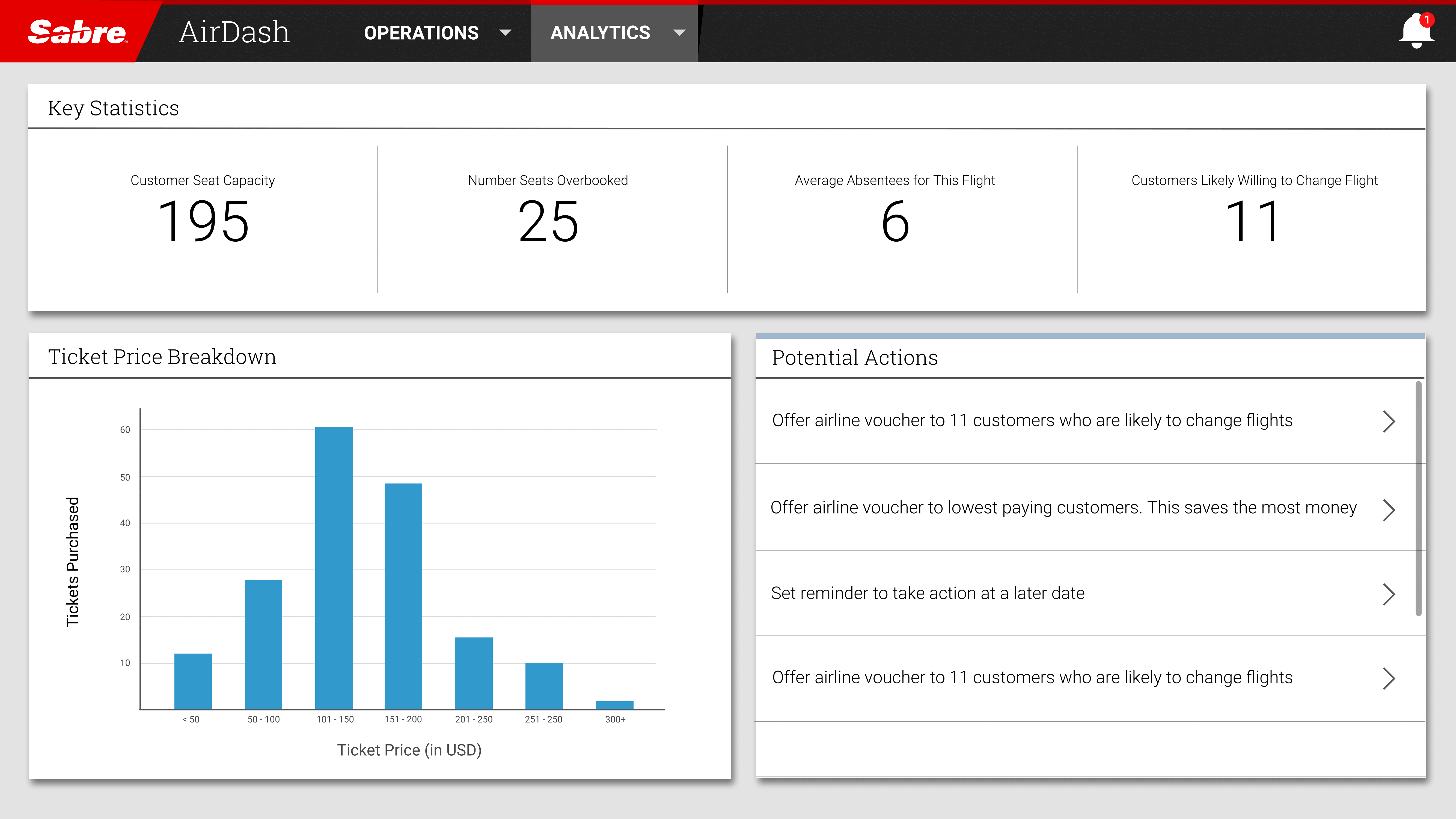
The dashboard would also allow you to drill down into the specifics of different parts of the business. You can look at views as broad as a whole region, or down to a specific flight. In this example, you are looking at the key statistics around a single flight. In our research, we discovered that it was important for the dashboard to not only display the data, but also give the user suggestions on what they should do to steer the airline in the optimal direction. Here, AirDash recongizes that there are 25 seats overbooked, and is offering suggestions to remediate this issue.
Mobile
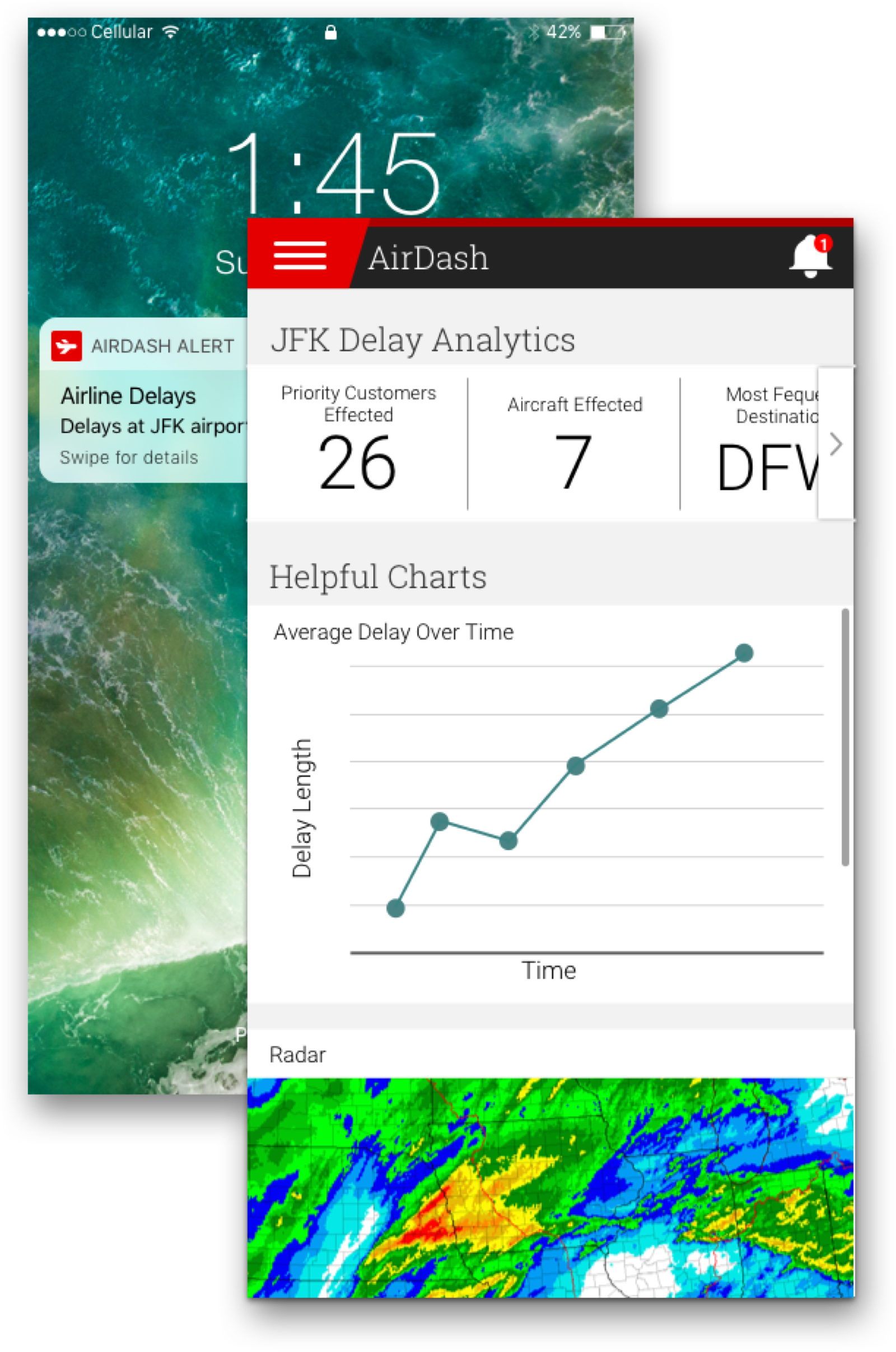
Everything would be mobile and customizable as well. It is important for people managing their airlines to have access to this critical information anytime they need it, whether they are in their office or on the go.
Produce

My team ended up receiving 3rd place out of 15 teams. It was a great experience to learn more about the company, and it stretched our problem-solving skills. We contacted and spoke with about 15 to 20 employees across the company to get our result. We all grew as my teammates figured out back-end technologies that would power AirDash, as well as crafting a business case to pitch to the leadership of the company.
Bea Wagner-Wilkins
Projects
© Copyright 2022 Bea Wagner-Wilkins
