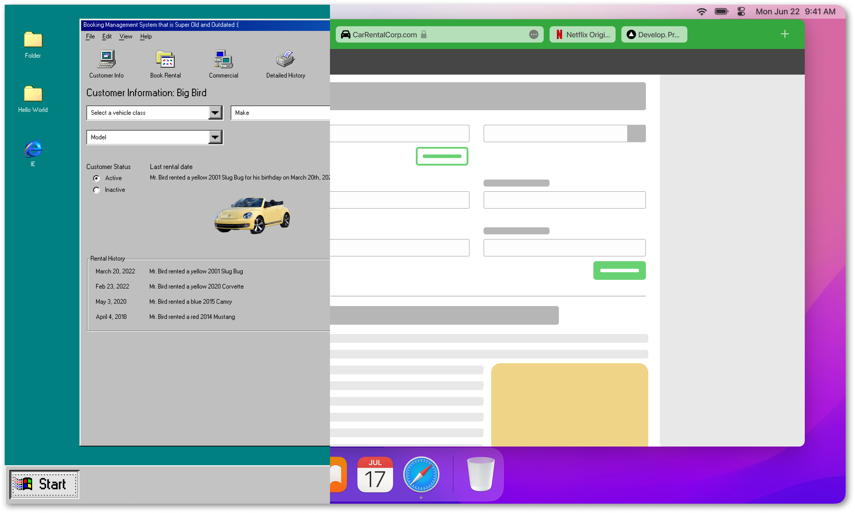
MODERNIZING A 23 YEAR-OLD APPLICATION
Rental Management Update
Rental Management Rehaul
Rental Management Rehaul
Rental Management Rehaul
// Leading Car Rental Corp.
// Leading Car Rental Corp.
// Leading Car Rental Corp.
// Leading Car Rental Corp.

(actual screen grabs cannot be shared due to NDA constraints)
The Proposal
My client was using a System that was 23 years old which was responsible for generating about 30% of their revenue. The System was becoming unreliable and inefficient due to getting mangled over the years as new features were haphazardly added as the business model expanded and the industry changed as a whole. My client was unsure of how to handle the transition to the new system and was intent on making sure it met both the business' and their employees' needs. They asked Slalom to provide guidance and conduct initial research to get pointed in the right direction.
Challenge
How might we best utilize our allotted 3-month time period to provide the Client with the most effective research and validate the results to ensure we are pointing them in the correct direction?
Solution Summary
This project was a very research-focused initiative that required a lot of collaboration with the Client's product owner, lead researcher, and legal teams. To get a lay of the land, we started with extensive demos of the System's current state. We were fortunate that the product owner at the Client was aware that there were a lot of issues with the System. They were open to considering the positive AND negative feedback we gathered (extra kudos because the product owner was the one who led the effort to build it in the first place back in 1999).
After my team obtained an initial understanding of the System, I created a research charter complete with a survey (1034 invitees, 194 responses) and field observation/interviews (14 participants). I synthesized the data in Miro to weed out the most prevalent trends, being sure to capture what is working well and what the System's weak points are. Once the research was complete, I created an easy to consume presentation documenting my findings. At the end of my term with the Client, I left recommendations on the next steps for research and testing.
ROLE
UX Research Lead
TOOLS
UserZoom, Teams, Figma, Miro
TIMELINE
3 months (April - June 2021)
Process Overview
? Learn
? Plan
? Interview
? Survey
✍️ Summarize
Learn ?
The System was robust with many features, so I took the time to see countless demos to gain an initial understanding of how the System worked. As a consultant, when I am onboarding onto a new project, it is important to me to get a first impression of the product from familiar internal experts. I keep probing until I can connect how different parts of the software interact and relate to one another. I do this to learn the company's assumptions that I may need to challenge and make my time with users more valuable by asking more thoughtful questions.
Plan ?
After obtaining a solid foundation on how the System operates, I created a research plan. I spent a bit of time going back and forth with the client, and I made a detailed charter to document the exact process I would follow to ensure their confidence and trust.
- You can view the Research Charter here
- You can view the Survey Questions here
I aimed to capture these three main points:
1
UNDERSTAND ease of use, task frequency, and overall experience satisfaction
2
CREATE A BASELINE of the current experience to use to measure success of the redesign
3
PRIORITIZE SCOPE according to the most pressing end user's needs
Interview ?
I observed 14 contact center employees as they completed actual tasks in the System. I asked employees to think aloud and share constructive feedback.

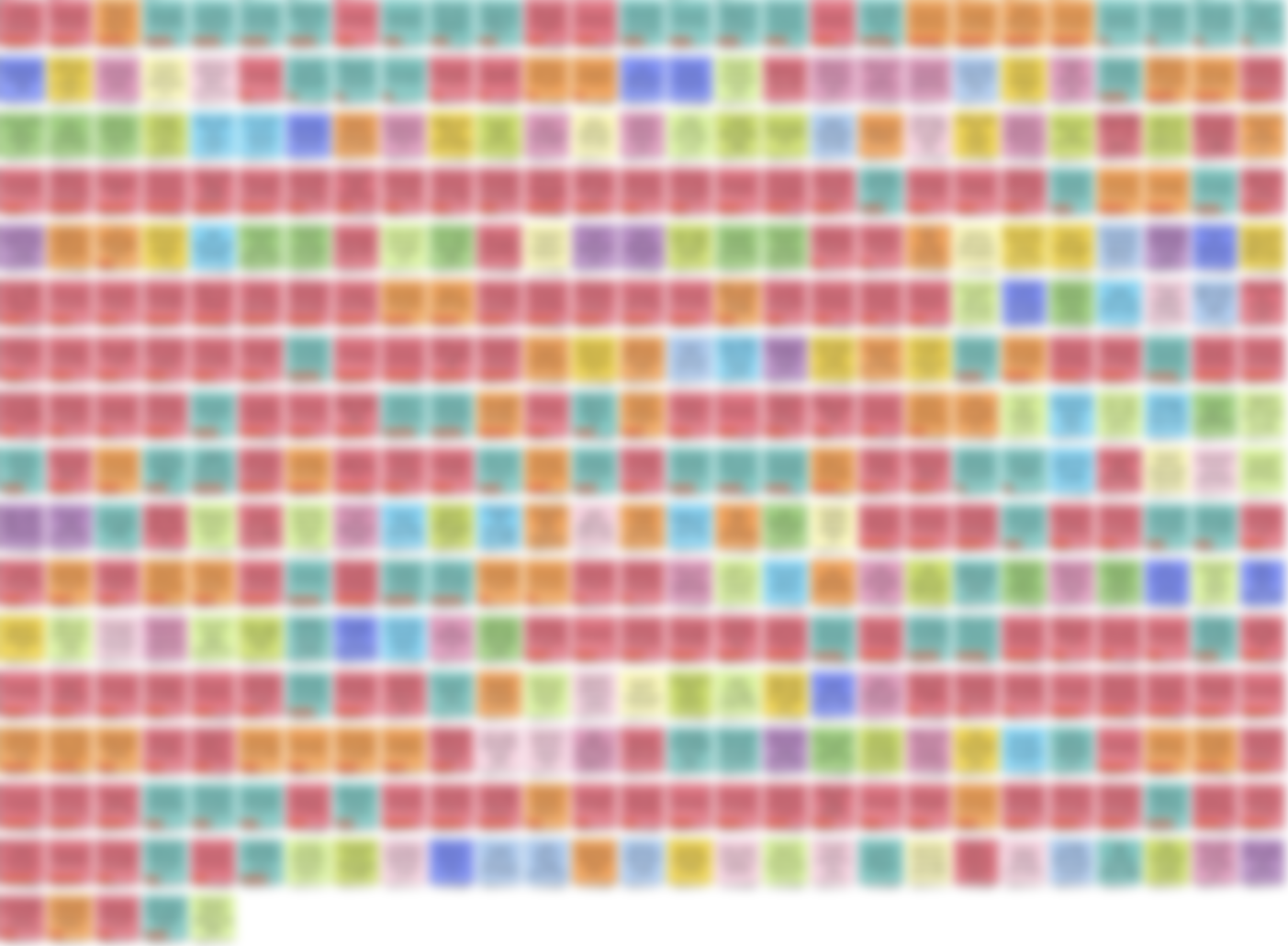
(Affinity map blurred due to NDA constraints)
Survey ?
I invited 1,034 contact center employees (194 responses) to complete a survey about how they use the System. The data showed the frequency of tasks, the effort level required, and satisfaction levels.
“ The system is very slow to update during the day. Some days the system is slow all day.
— Survey Respondent
Summarize ✍️
When I completed the interviews and surveys, we had a TON of data to sift through. I decided to code the interviews, pull out all opinions, and put them on individual sticky notes in Miro. I sorted 542 unique ideas to categorize to discover what improvements we could make and what users liked about the System to emulate as we began the building process.
Key Takeaways
01. Modern Future UX
Reduced scrolling, more intelligent, more predictive UI. They want a more modern experience but need an experience that brings them to the future.
02. I’ll do it my way
The System is unofficially part of the Microsoft Office Suite. There are too many ad hoc workflows used to make up for the System's lack of core features.
03. Dear diary
While having the highest ease of use rating, notes also had some of the most pointed feedback. Notes were found to be inefficient and time-consuming.
04. Calculator craziness
Overall lack of automation and trust with the calculation tools.
05. I still haven’t found what I’m looking for...
Better, more intelligent search. More informative and transparent, location, rates, and vehicle information.
06. Multitasking superpowers
Desire to work in multiple instances, windows, or tabs. Increased app speed and overall reliability.
Bea Wagner-Wilkins
Projects
© Copyright 2022 Bea Wagner-Wilkins